Energy Heroes
BrandCraft for a charity that brings sustainability into the maths and science primary schools already teach.
Planet approved. Brand kit delivered.
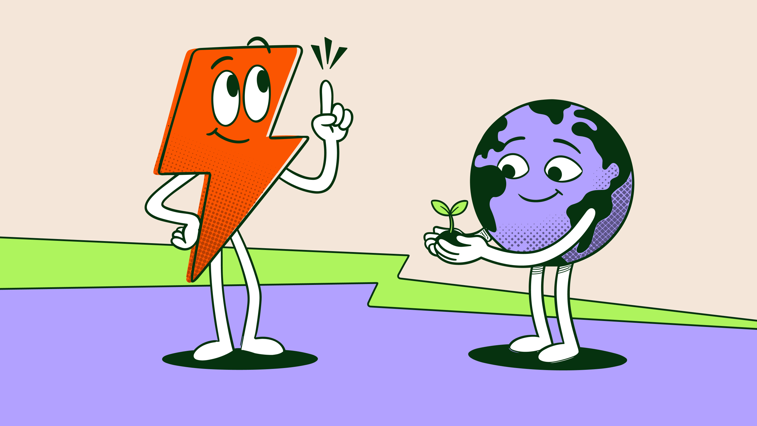
Energy Heroes brings sustainability into the maths and science that primary schools already teach. We rebuilt the brand from the strategy up, with the team in the room at every stage.
BrandCore strategy and messaging. Primary, horizontal and icon logos in Forest and white. Four characters in PNG and SVG. The flourish, dividers and backgrounds. Social assets. Gabarito. Full guidelines and the Figma file. AI prompts and character descriptions, so the team can create new poses themselves.
The brief
Heroes find out. So did we.
“We’re a drop in the ocean,” Clare, the project manager, told us on our first call. “But I think our ripple effect is very big.”
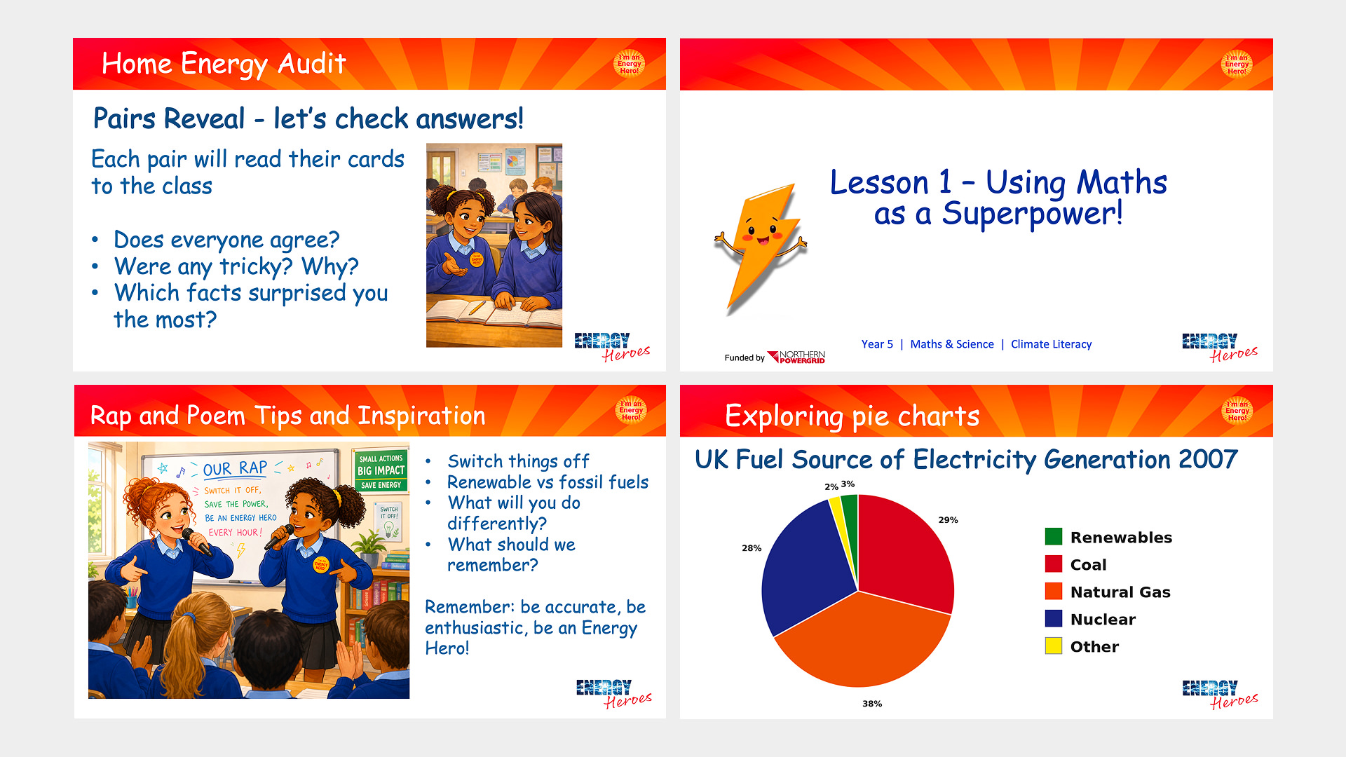
Energy Heroes is a UK charity that has run its energy and climate programme in primary schools for more than ten years. A specialist leads every visit. The day includes a whole-school assembly, a Year 5 workshop, an energy audit led by pupils and an action plan the pupils write themselves. Northern Powergrid funds the programme, which is free to 50 schools a year in its region.
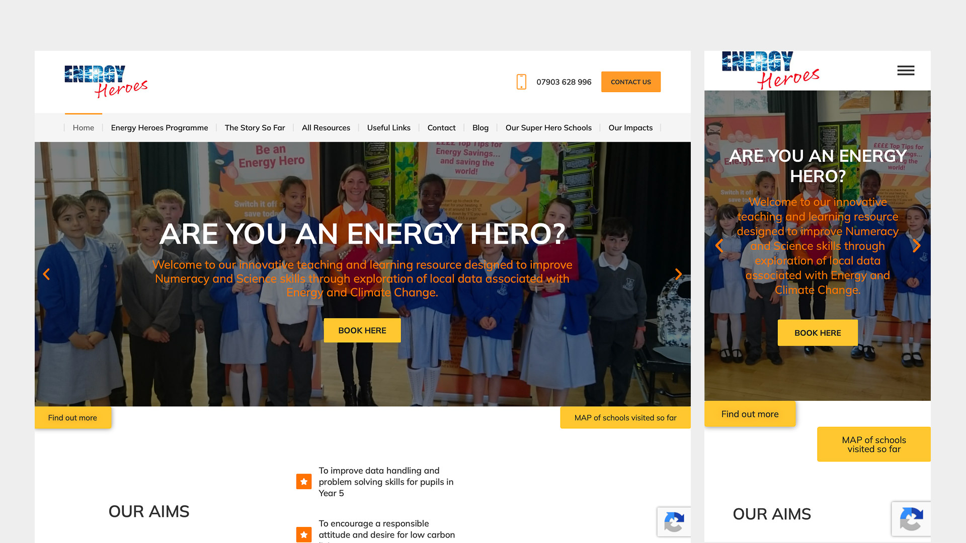
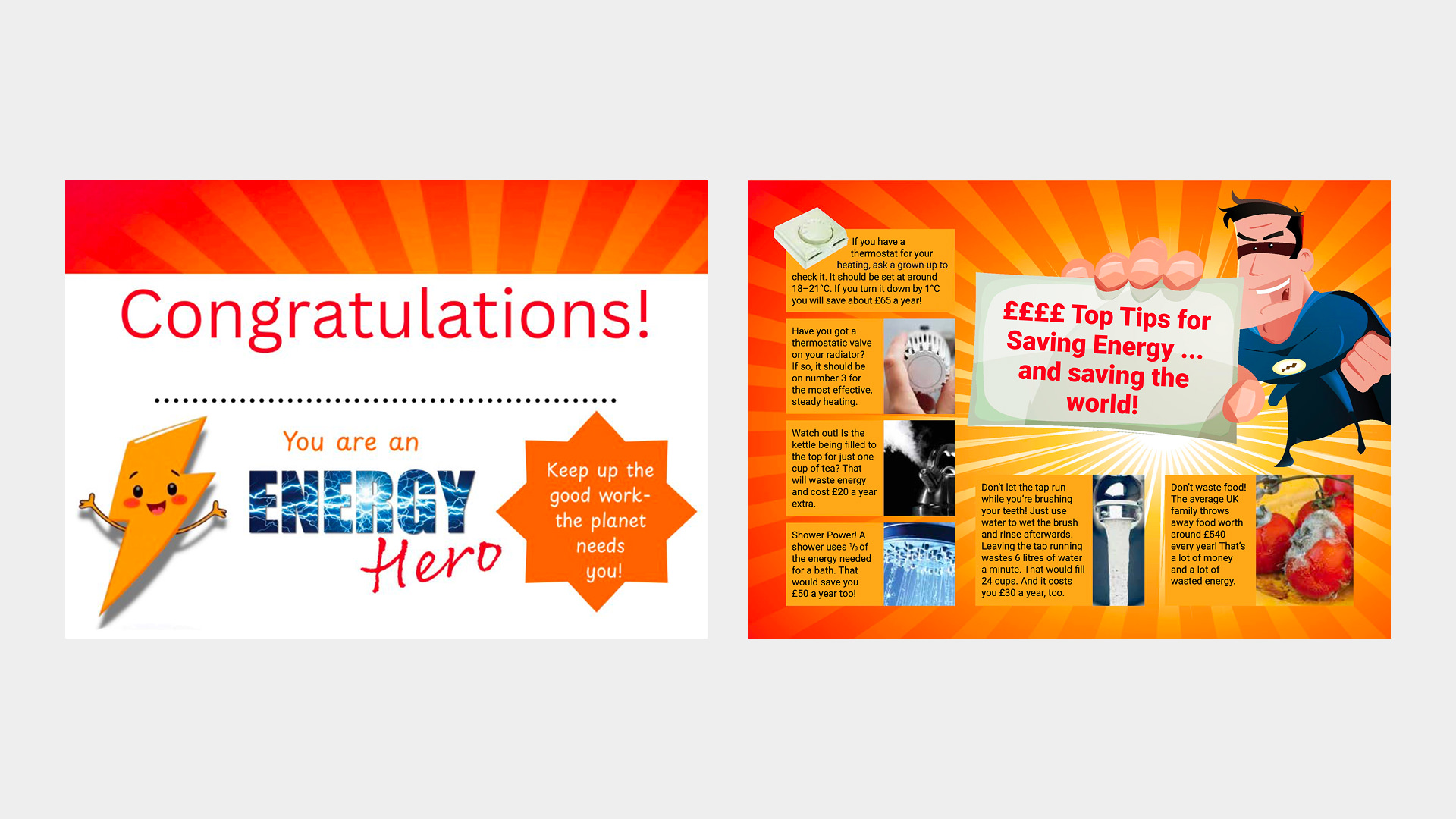
The brand had not kept pace with the programme. It grew in pieces as people came and went, and apart from the orange, nothing held it together. “I don’t think we really have a brand,” Clare said. “There’s a thread of something that goes through it.” What the team wanted was simple: “one less decision to make and discussion to have.”
BrandCore
Evolution, not revolution.
BrandCraft moves in four stages. BrandCore defines what is true. Universes define how the brand should feel. Galaxies explore where it could go. Planet is where it lands. Every design decision is checked against the strategy, so the identity can be defended. It is not a matter of taste.
The foundations had been started. The team had a mission, a draft vision and four values they believed in. Our job was to sharpen them, fill the gaps and make every part say the same thing.
Version 0.5 is built to be argued with. Ours proposed “make the curriculum matter”. Vikki, a co-founder and former deputy head, saw the problem at once: “It screams to me that the teachers don’t think the curriculum does matter.” Then Sue, the education lead, named something no document had: “A lot of our first contacts in schools now are the eco leads.” Sustainability was the way in, and the curriculum was how it would be taught.
Version 1.0 turned the idea round.
Bring sustainability into core learning. The belief: heroes find out. Children can work things out and decide for themselves.
The team set their own guardrails. Clare pointed out that children are already empowered, so “empower” left the language. On impact she was direct: “What I’m struggling with is being honest about our impact, not overpromising.” So the strategy claims nothing the evidence cannot show. A hero became someone who gets curious, looks at the evidence and works out what to do. A hero is never a rescuer, and the weight of the problem stays with adults.
Sue summed up the tone of voice work: “I think we’re already doing it fine. It’s just good to see it really clearly in front of you.” That was the point.

The identity
Bright for children. Calm for teachers.
Built with the Energy Heroes team across our BrandCraft expression workshops, not revealed to them at the end. Every piece of feedback was framed against the brand, so the conversation stayed on what Energy Heroes needed.
Universes
We presented three moodboard directions, all built from the same core.
Show Your Working. Hand-drawn marks of a mind at work, drawn over portraits so the child becomes the hero of the page.
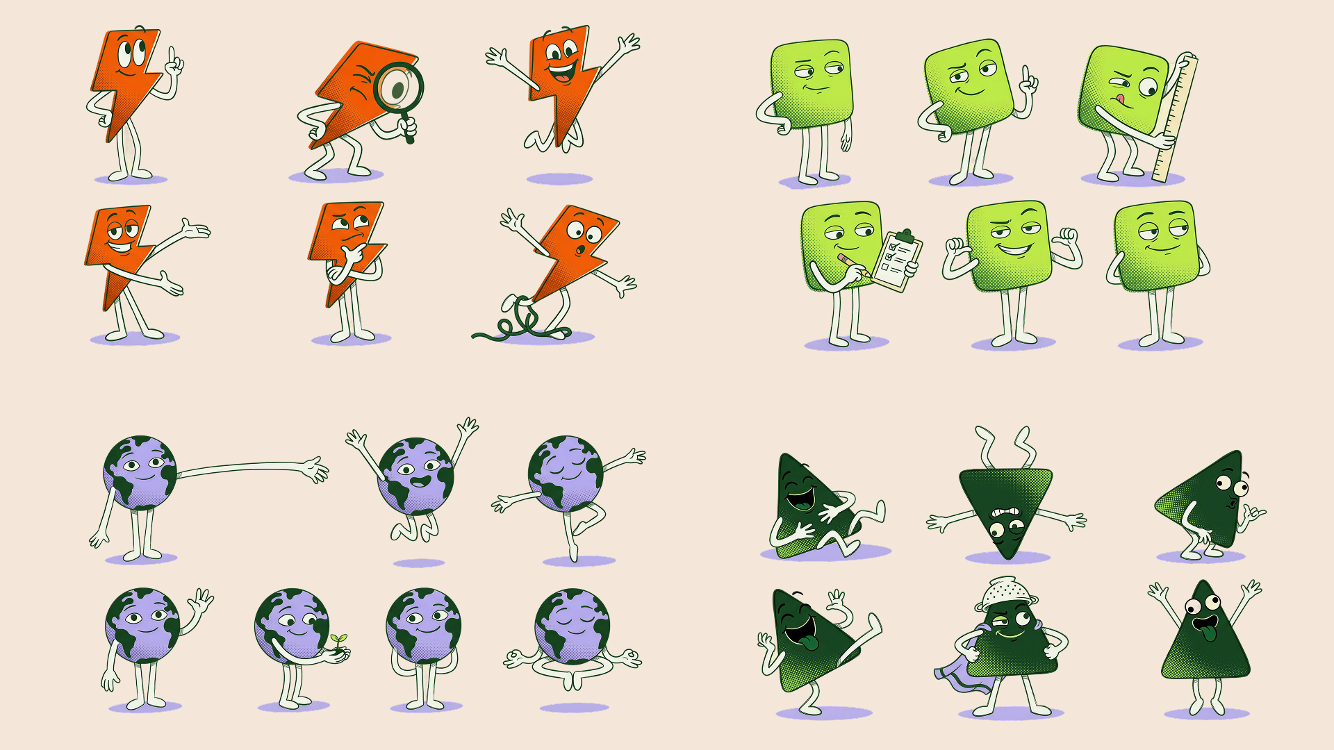
The Finders. A crew of simple shape characters led by Zappy, the programme’s lightning bolt.
Piece It Together. Bold shapes that join into something new, with no characters.
Feedback went one voice at a time and stayed tied to the brand. The Finders led. Of the photography, Clare said: “They don’t look cocky and arrogant. They look like children that are very confident.” Piece It Together was the cleverest option and the least like Energy Heroes, because it felt corporate. Sue warned that a character for every topic is a tired classroom trope, so the cast is capped on purpose. The team raised accessibility in the first round: dyslexia, visual stress and visual noise. It became a workstream of its own, not a check at the end.


Galaxies
Both galaxies grew from The Finders. One was bright and rounded, with four colourful characters. The other was stripped back, with three single-colour characters, one typeface and a cleaner stacked logo.
The room split. “When you showed me the first one, it made me feel really happy,” Clare said. Vikki looked at the second and said: “I actually think this looks really mathematical.” Then she named the real tension: children do not choose Energy Heroes. Teachers and headteachers do. But if the children do not engage, the teachers will not care either.
So we stopped choosing between galaxies and split the job.
Logo and type lean teacher. One typeface, Gabarito, and a stacked wordmark that feels credible and stable.
Colour flexes. Brighter and fuller for children, more restrained for teachers.
Characters lean children. They carry the play, the humour and the energy.
Many of the details came from the team. Sue suggested running the bolt through the middle of the logo and letting the letters play around it, and that is how the wordmark now works. Clare loved the three spark marks around the logo, but they made it busy. So they moved: shaped like the logo bolt, they now mark movement beside the characters. Vikki felt the Blob looked closer to a germ than to the Earth, and Clare missed the earth in the cast. The Blob left, a goofy triangle took over its jokes, and the circle became Earth.
Zappy has the best arc. “I invented Zappy because we originally had a character that we all agreed we didn’t want anymore,” Sue told us. “Zappy just appeared.” The stopgap now leads a cast of four.
Galaxy A


Galaxy B


Planet
Planet settled what Galaxies left open. The deep green, Forest, had felt too heavy as a background, so it stopped being one. The page is now Earth, a warm neutral, and Forest carries the type, outlines and shadows. The trust stayed. The weight went.
Every rule was written so the team would not have to stop and think. The logo is one colour on everything. Every character shadow is Forest, whatever sits behind it. One flourish and one divider, both cut from the logo bolt, connect the whole system. Gabarito is the only typeface, which keeps the brand credible for teachers while the characters and colour carry the fun. Sue had backed Amaranth, and changed her mind in the room: “I thought I was going to miss the Amaranth, but I completely get what you’re saying, that all the goodness and fun is in the characters.”
The maths had to stay honest too. One mockup stepped the tops of a bar chart into the bolt shape. Vikki stopped it, because children should never learn to draw bars that way. Data stays accurate, and the bolt lives in the dividers, never in the numbers.
Clare summed up the move from Galaxies: “It’s toned down what needed toning down, and brought out what needs bringing out, and kept the playfulness.”



Built for real classrooms
Made to survive a greyscale school printer.
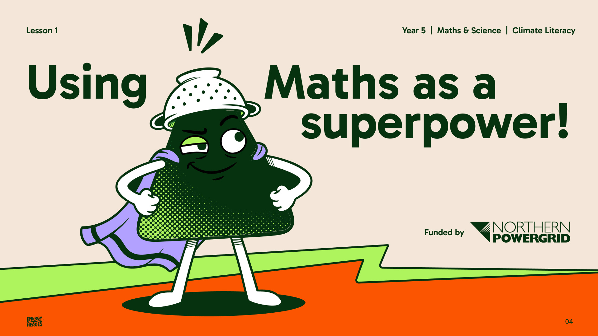
School wifi can drop mid-assembly, so lessons run from downloaded PowerPoints, not live links. Schools print in black and white whenever they can. The identity is built around that. Assets stay light. Every character keeps an outline that holds on any background, and its halftone texture carries extra contrast so it survives a greyscale school printer.

Outcome
One brand where it used to have pieces.
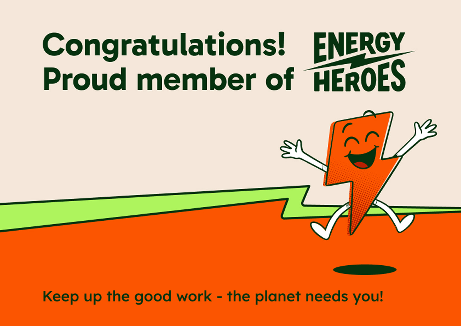
Energy Heroes now has a BrandCore the team shaped line by line, and an identity that flexes from a Year 5 workshop to a headteacher’s inbox.


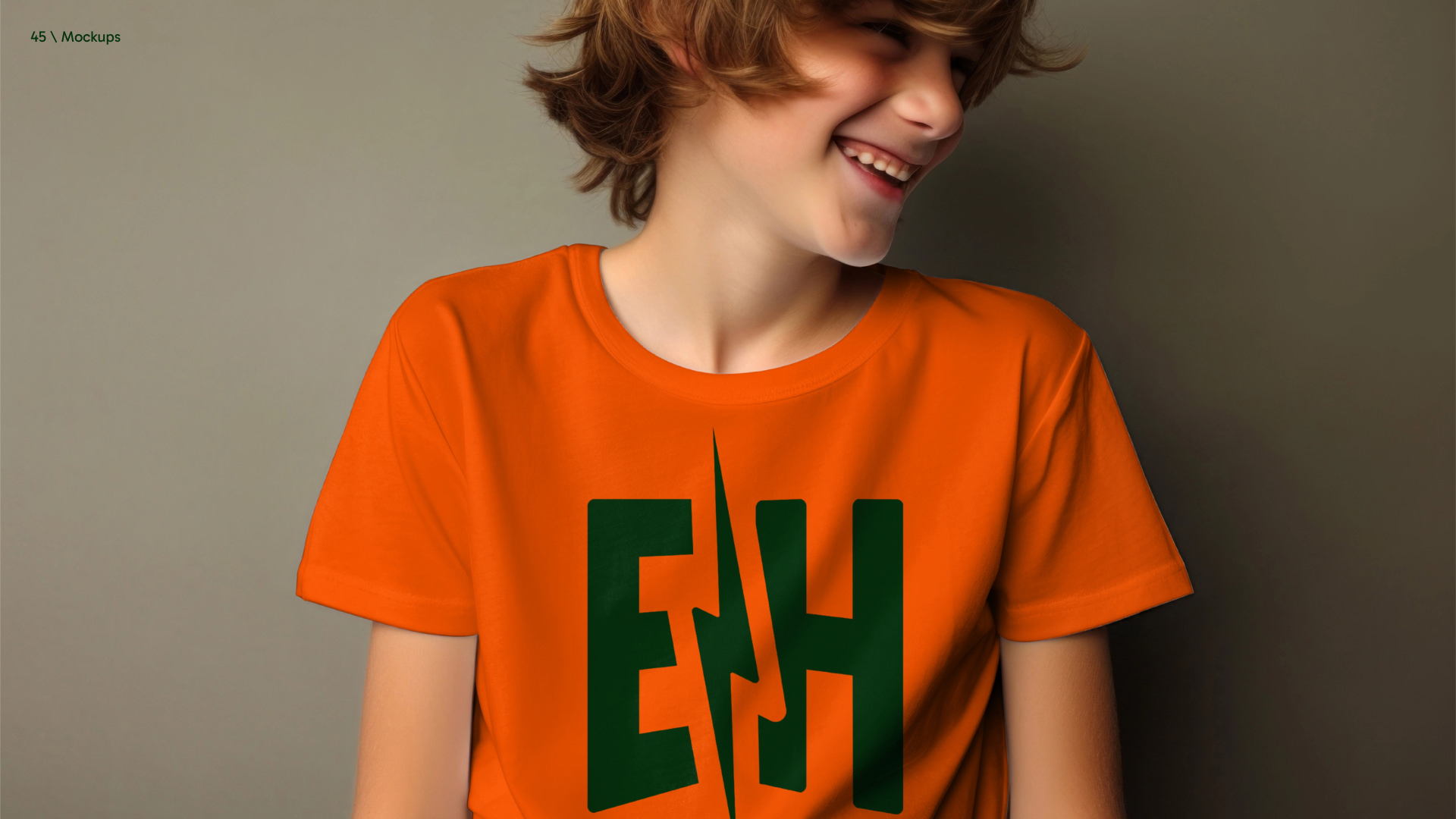
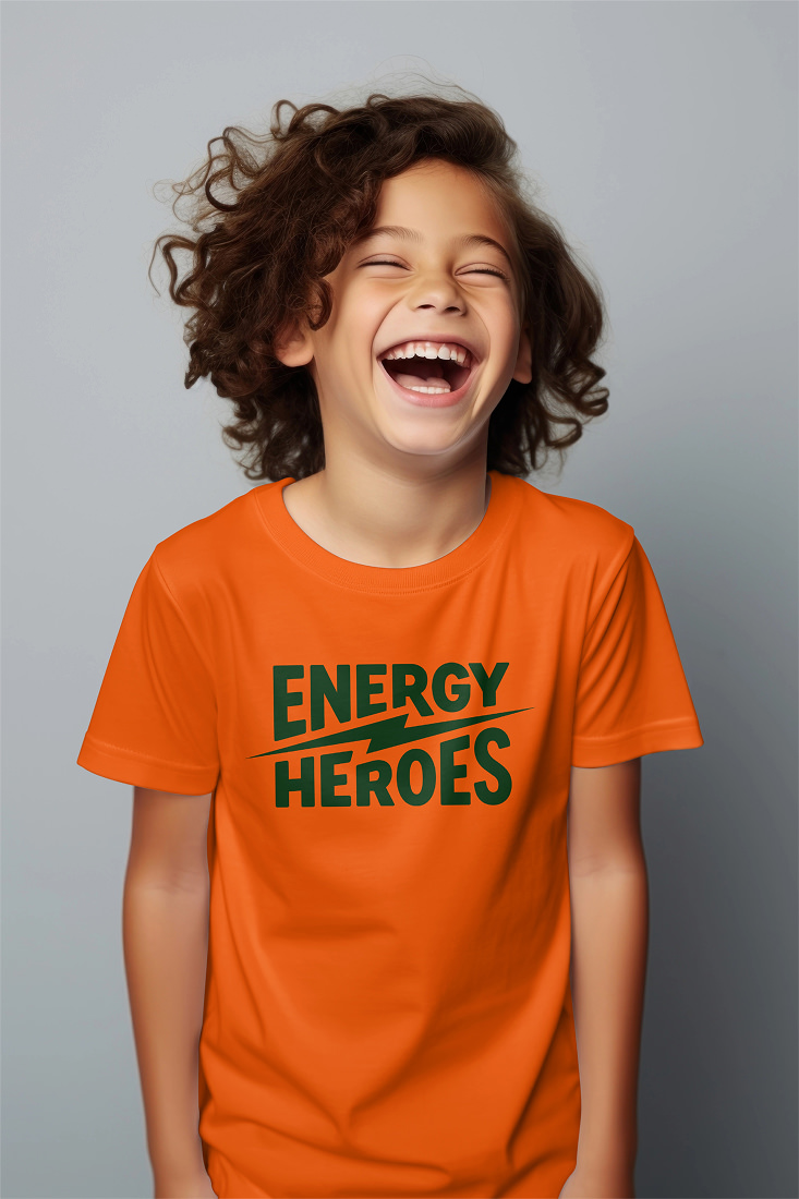

The brand kit holds:
- primary, horizontal and icon logos in Forest and white
- four characters in PNG and SVG
- the flourish, dividers and backgrounds
- social assets
- Gabarito
- full guidelines
- the BrandCore and the Figma file
- AI prompts and character descriptions, so the team can create new poses themselves
The team now owns its next decisions. In Vikki’s words: “Compared to our competitors, I think we’ve got something really different, and that’s part of what we are trying to achieve through this process.”
Going through this process has created opportunities for us to enhance the programme.
Vikki Pendry, Co-founder, Energy Heroes
Every time I come to the meeting, I’m like, this is creating our future.
Clare, Project manager, Energy Heroes
Energy Heroes teaches primary school children about energy and climate through the maths and science they already learn, and it leads with hope. Climate education that leaves children curious is good for people and the planet. That is the test.
Who we work with, and whyPlanet approved. Brand kit delivered.
10+ | Years in UK primary schools 50 | Schools a year, free in Northern Powergrid’s region 3 → 2 → 1 | Universes, galaxies, one planet
We wouldn’t have come to a decision as easily in another project. Although we’ve all got our individual favourite colours, actually we’re on the same page more or less. And with your really skilled facilitation, we’ve been able to reach a consensus.

What does Energy Heroes do?
Energy Heroes is a UK charity that brings sustainability into the maths and science primary schools already teach. A specialist leads every visit, and Northern Powergrid funds the programme, free to 50 schools a year in its region.
Why move the hero from rescuing to finding out?
A hero here gets curious, looks at the evidence and works out what to do. A hero is never a rescuer, because the weight of the problem stays with adults.
How does one brand work for children and teachers?
The job is split. The logo and type lean teacher, with one typeface and a stable stacked wordmark. Colour flexes, brighter for children and more restrained for teachers. The characters lean children and carry the play.
Does it work in black and white?
Yes. Every character keeps an outline that holds on any background, and its halftone texture carries extra contrast so it survives a greyscale school printer.
Where is the project now?
The planet is approved and the brand kit is delivered: logos, four characters, Gabarito, full guidelines, the BrandCore and the Figma file.
More work
See all work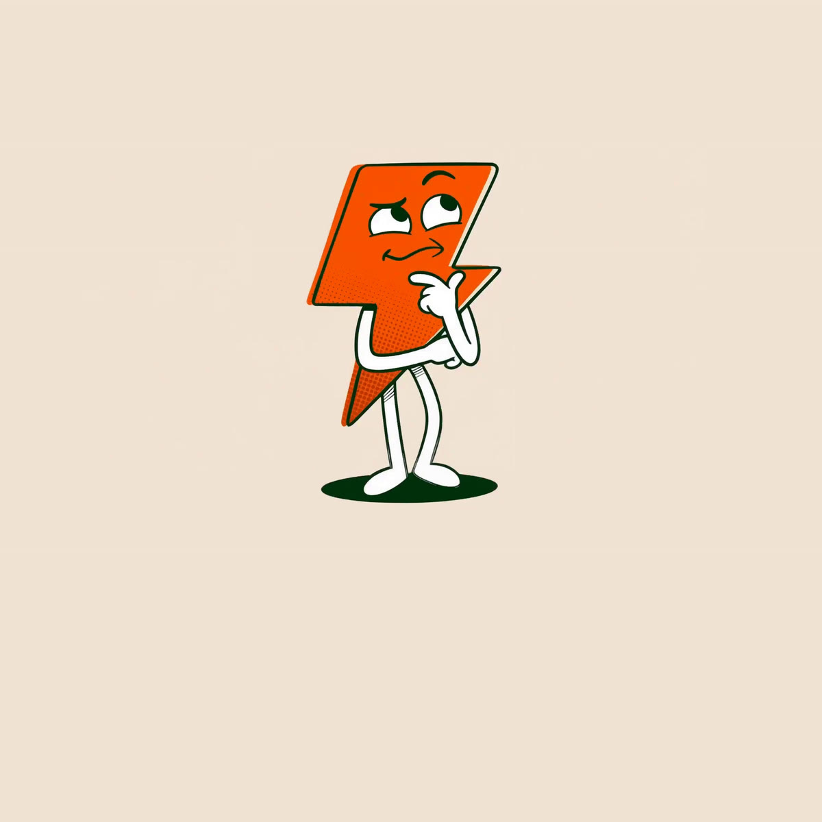


If you’ve outgrown the way the market sees you, that’s worth twenty minutes.
A straight conversation about where you are and what you need. If someone else would suit you better, we’ll tell you.