
Bespoke, BrandCraft
Client
SB Collective
Services
Date
2026
Result
SB Collective connects project managers in advertising and tech with meaningful work, through a community built on real relationships. After more than a decade under two names, founder Sarah Buttaci needed a brand built for where the business is going. We partnered with her on a new name, brand identity, and website.
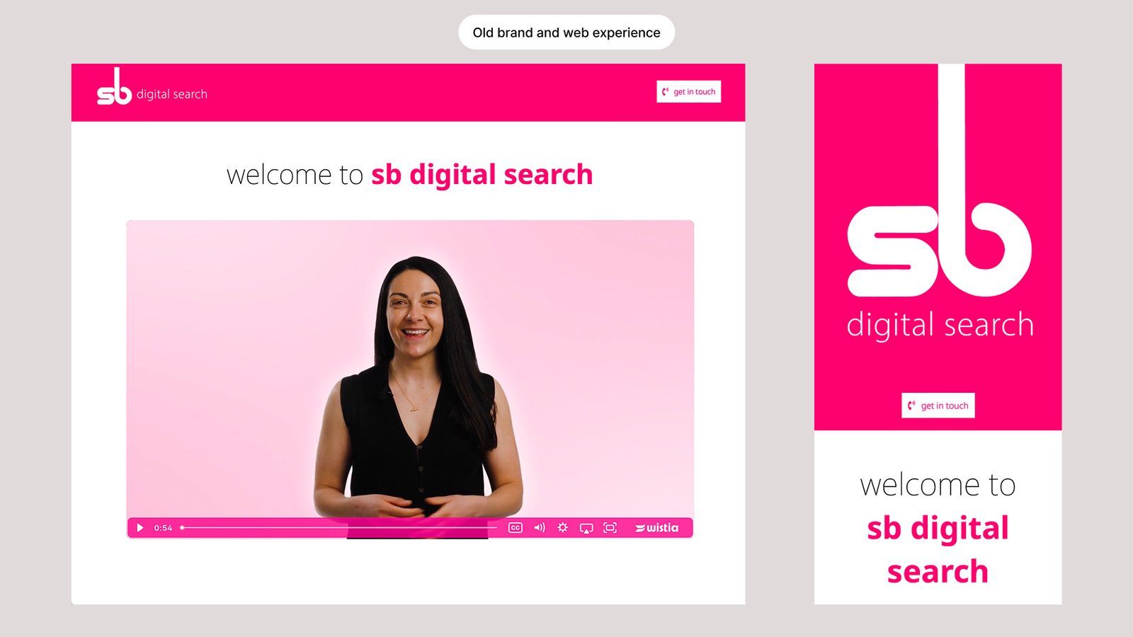
For over a decade, Sarah Buttaci built a respected recruitment business for project managers in advertising and tech. It ran under two names, SB Digital Search and SB PM Network, and was held together by one lowercase “sb” and a signature hot pink.
The business had outgrown its brand. Sarah was no longer only a recruiter. She had built a thriving community, was hosting events, and was adding new ways to support the delivery profession. The old names described one part of what she did. The brand had not been revisited since launch.
Sarah knew a rebrand was overdue, but as a busy founder she did not have the time or headspace for a long process. The task was to rename the business, redefine what it stood for, and build a visual identity that would carry it for the next decade. All of this had to happen quickly and without pulling her away from running the business.
Before any name or visual was explored, we built SB Collective’s BrandCore. Through a founder questionnaire and a series of focused conversations, we defined its purpose, mission, vision, values, audiences, positioning, personality, and tone of voice. This became the strategic foundation for every decision that followed.
At its centre is a clear position. While recruitment races towards automation, SB Collective doubles down on human relationships. No algorithmic matching. No cold outreach to strangers. Just people who actually know each other. This shaped the brand promise: “You’re not hiring strangers. You’re not being hired by strangers.”
“Tokyo Calm helped me rename and fully rebrand my business in just 20 days, a process I’d been putting off for years. He made what felt overwhelming completely seamless and stress-free. His ability to listen, guide, and create clarity meant decisions felt easy and aligned.”
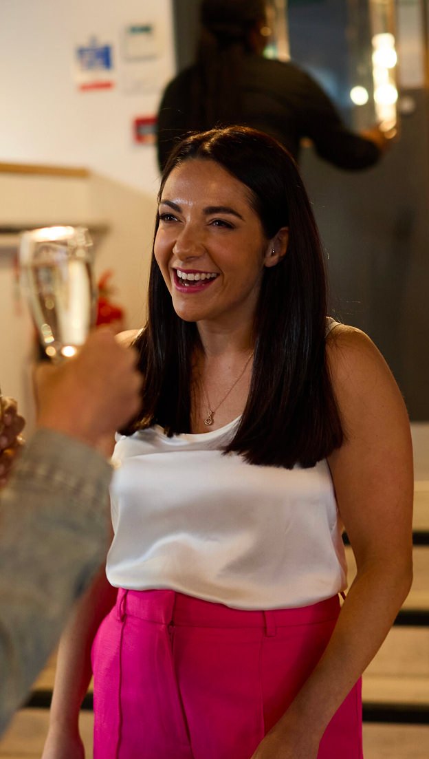
Sarah Buttaci
Founder, SB Collective
The strategy also defined who SB Collective serves and what each audience needs. Delivery professionals want ongoing support, not to be treated as a CV in a database. Hiring leaders want trusted talent and certainty, not sales pitches. It set the brand’s positioning as affordable premium: premium in quality and expectation, not in cost or exclusivity.
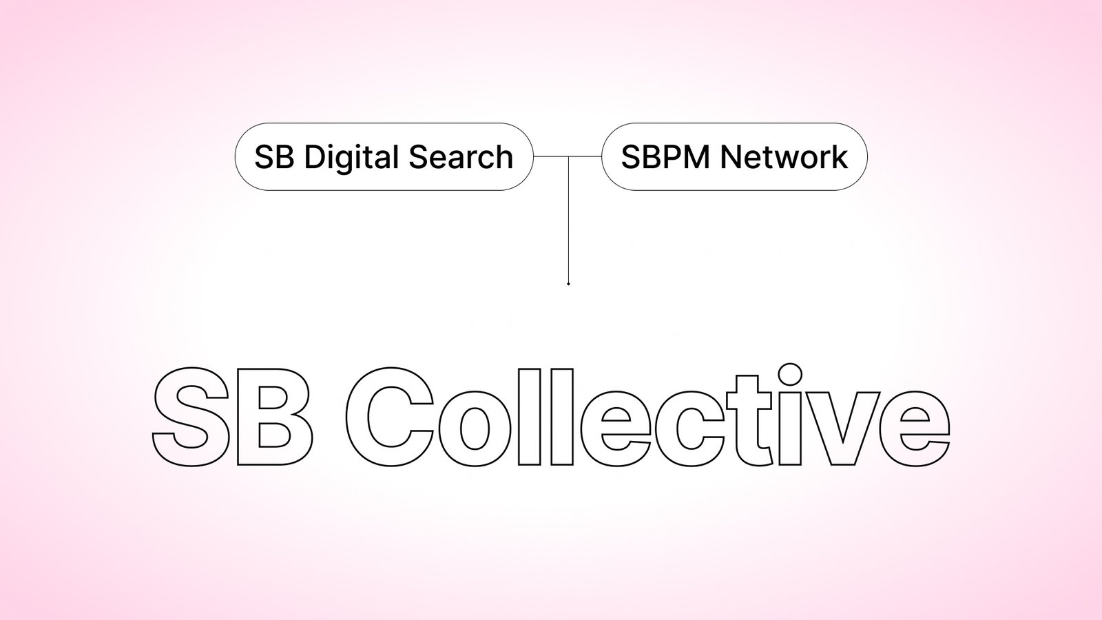
The name came directly out of this work. SB Collective brings two separate businesses, SB Digital Search and SB PM Network, together under one brand for the first time. The strategy made it clear that Sarah’s reputation was the foundation, so “SB” had to stay. Moving it into capitals signals growth and a more confident business. “Collective” captures both the community at its heart and the connected offerings now sitting beneath it: Search, Network, and Partners.
We presented four creative directions, each a distinct way of expressing the BrandCore.
Structure meets soul paired systematic precision with human warmth, built around separate shapes coming together to form a central point. Reverberation used pulsing forms and an energetic palette to show how community momentum builds. Charge type let bold typography do the heavy lifting. The missing piece used interlocking shapes to express the precision of a perfect match.
Sarah’s feedback was clear and decisive. She wanted energy and colour that reflected the creative industries she serves. She wanted to keep a link to her heritage pink without being defined by it. She also wanted recruitment to remain the lead, with the community supporting it.
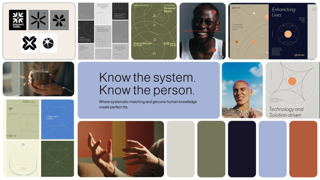
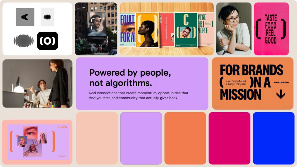
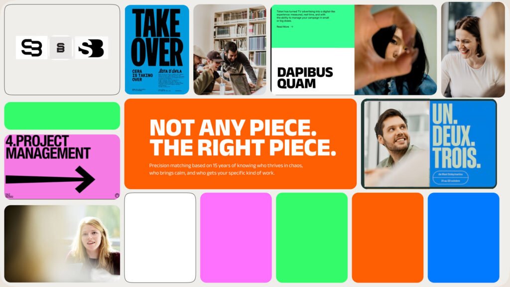
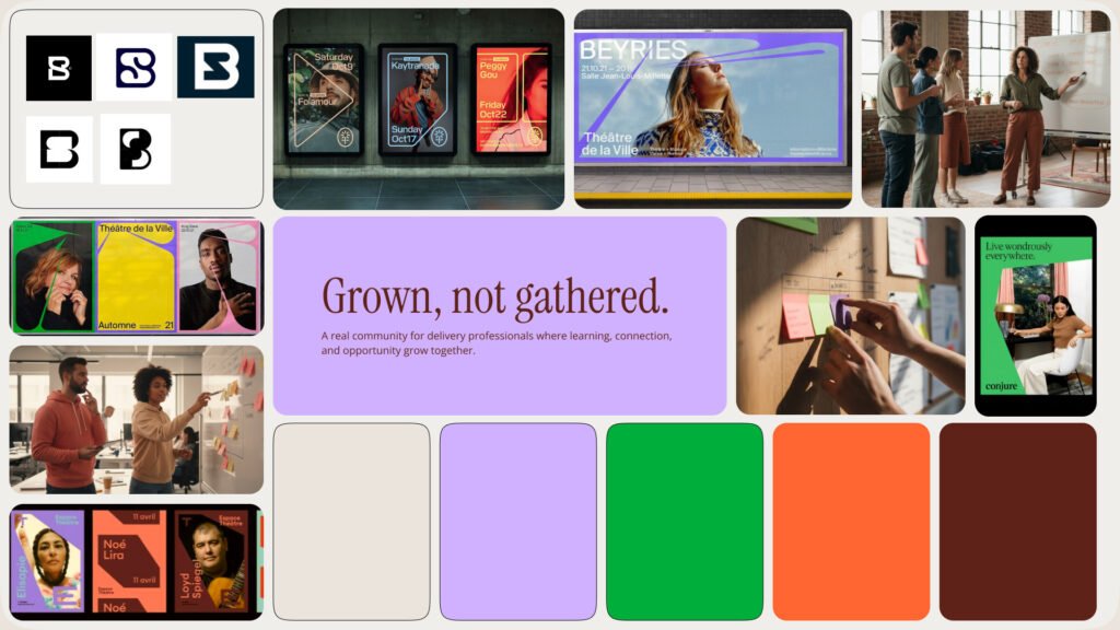
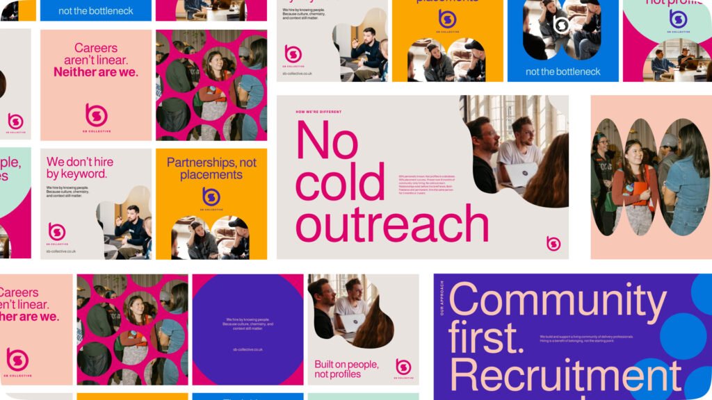
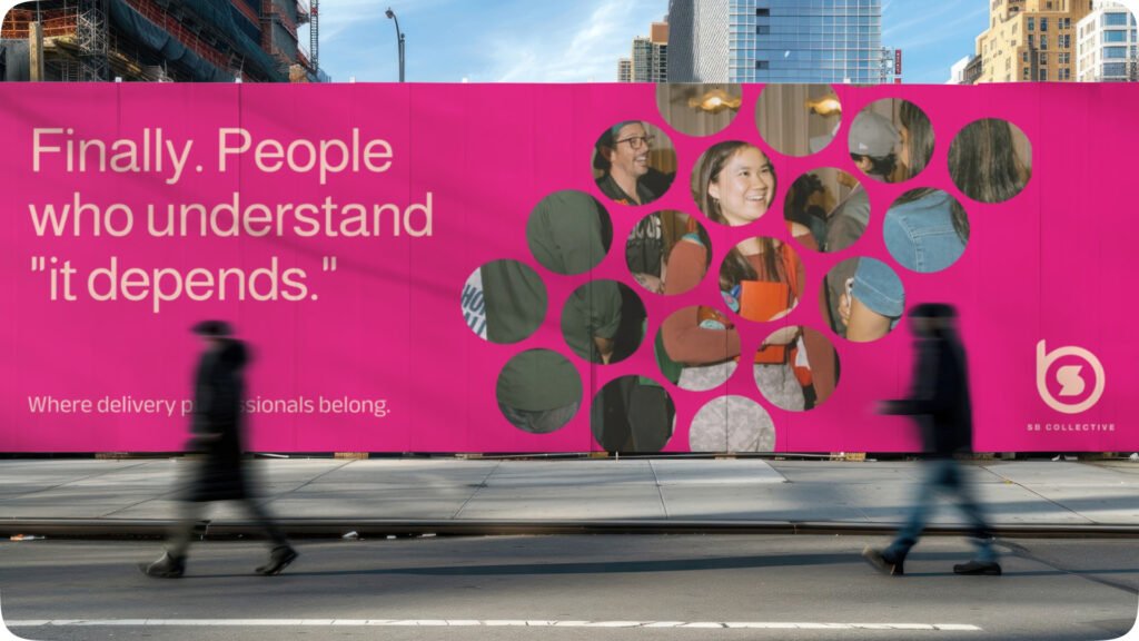
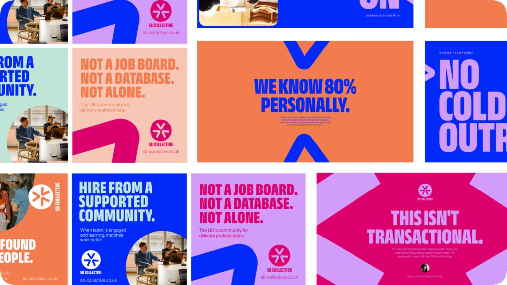
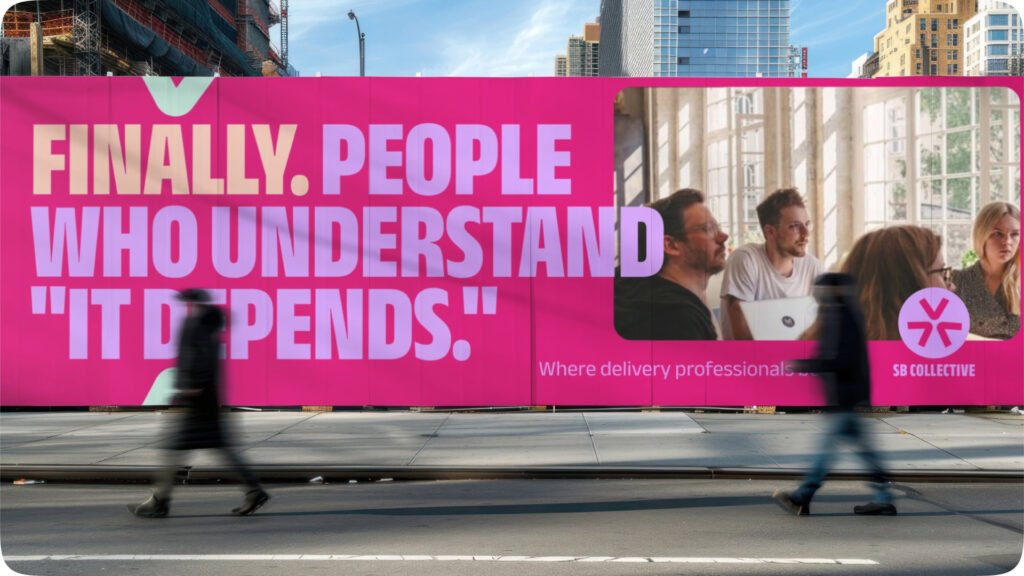
The final identity draws the strongest elements from across the directions into one system.
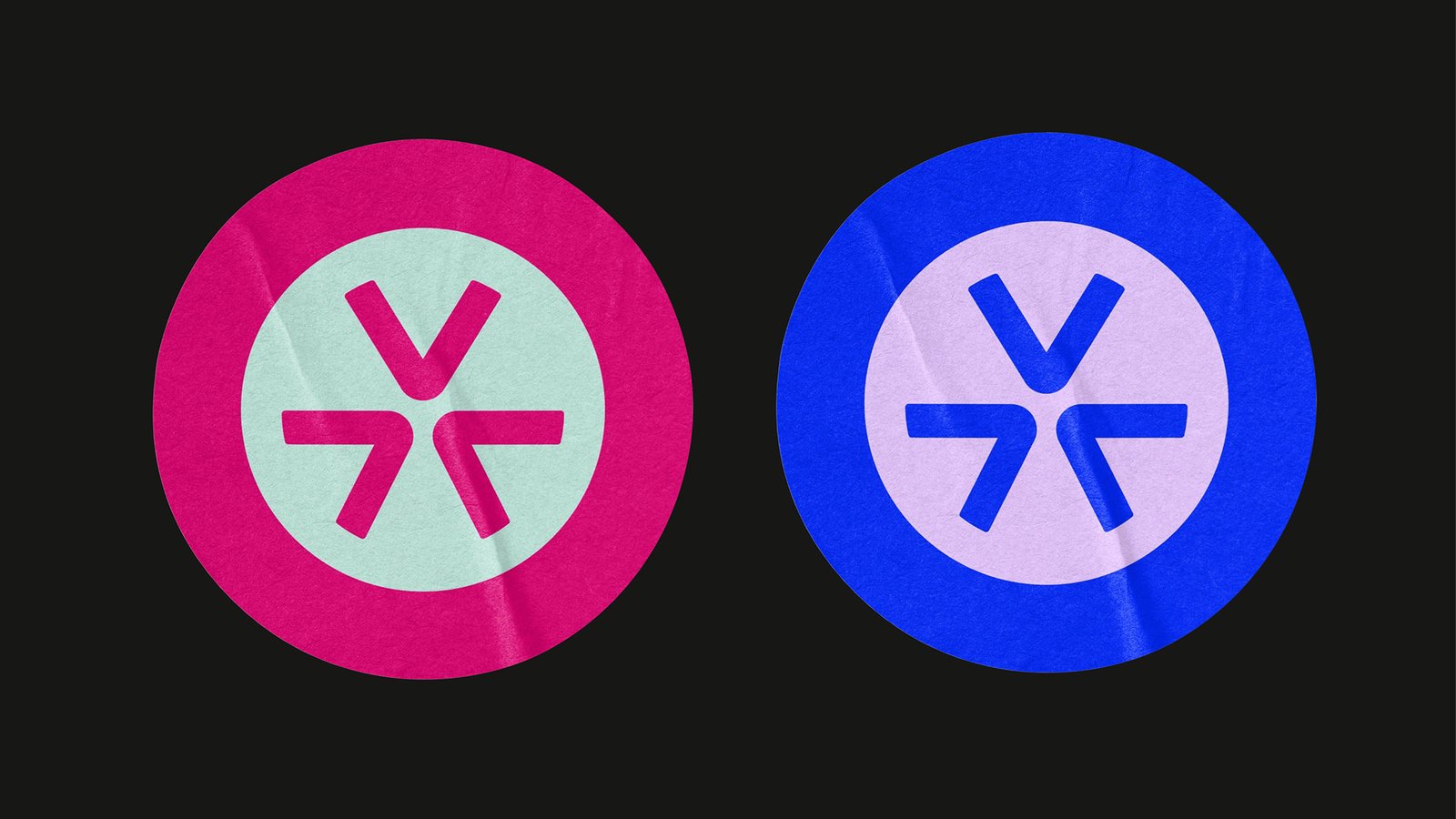
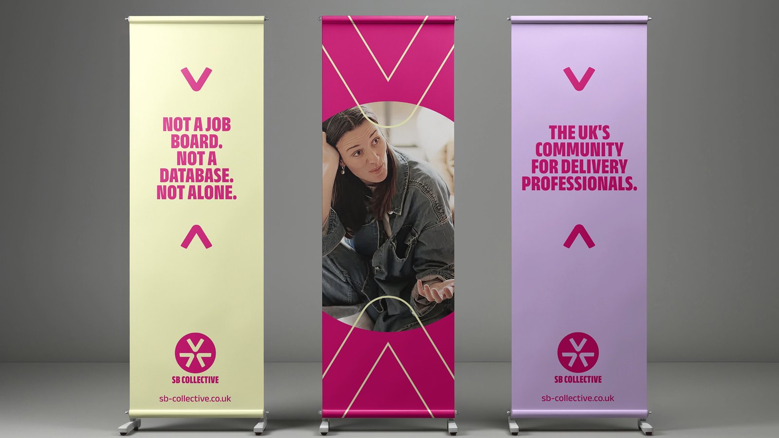
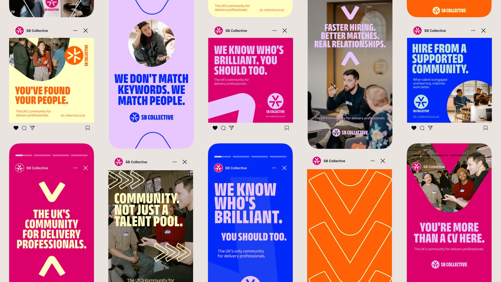
The logo is built from three chevron shapes pointing inward to a shared centre. They represent Search, Network, and Partners converging into one ecosystem. Separated, the shapes become a flexible graphic device that frames images, points to key information, and creates movement across layouts.
Hot pink remains the primary logo colour, the thread that connects Sarah’s history to where the business is going. It now sits within a wider palette of cobalt, purple, orange, mint, and yellow. This gives the brand range, from calm and supportive moments to bold celebration.
Headlines are set in Anek Bangla Condensed Extra Bold in capitals: structured and confident without being corporate. Photography is candid and unpolished, showing real people at real events, because the community is real.
Animation by Chris Dack and Motion Matters

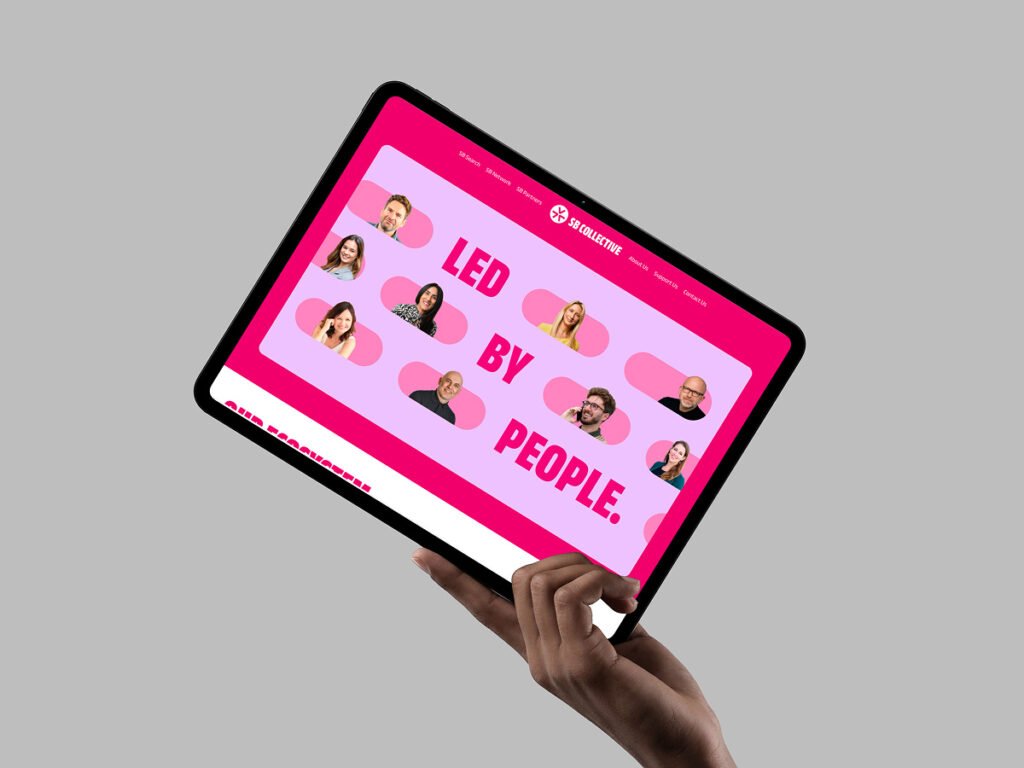
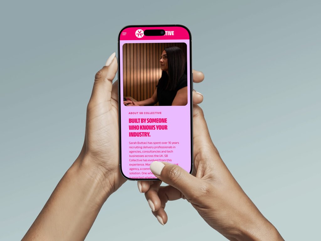
We also designed the SB Collective website, bringing the new identity and messaging to life across one connected home for Search, Network, and Partners.
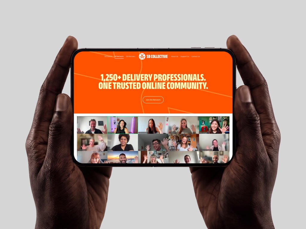
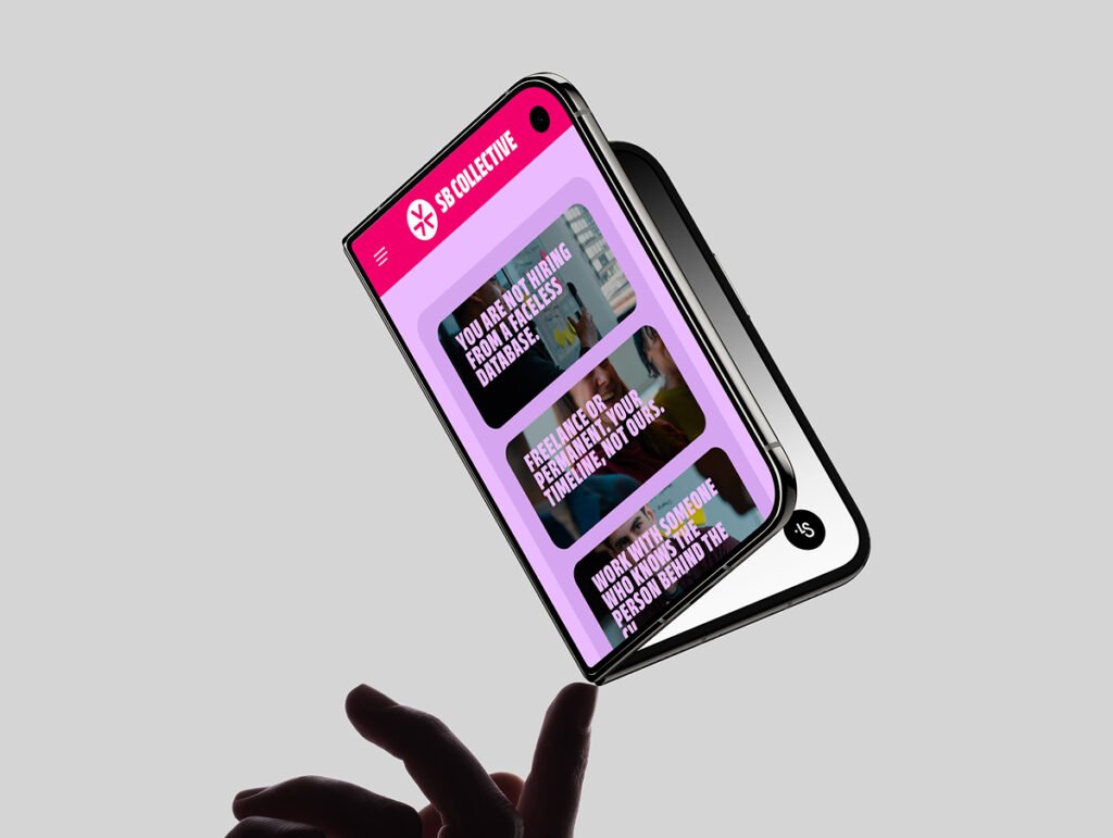
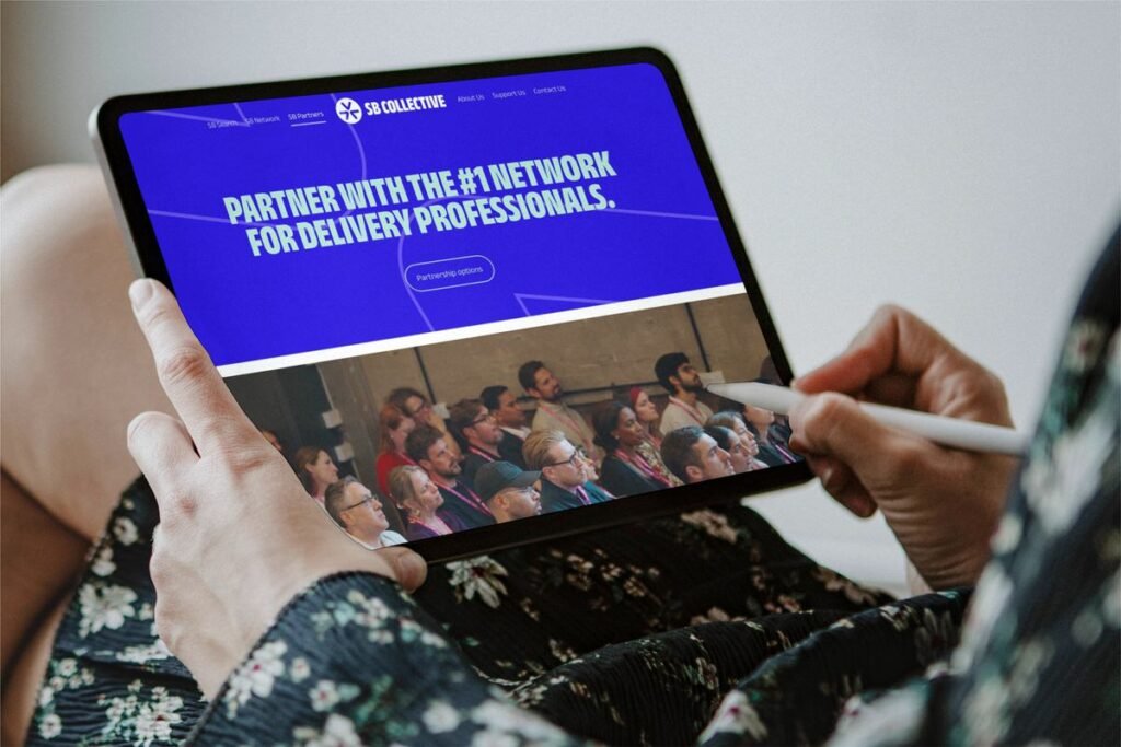
In 20 days and four video calls, SB Collective was renamed and fully rebranded. The relaunch gave Sarah a clear articulation of what her business stands for, a name built to grow with her, and an identity designed to last. It repositioned a founder-led recruitment business as a broader, more confident platform for the delivery community.
Other Work
(Case Studies)
Every great brand starts with a conversation.
Navigation
Legal



Copyright © Tokyo Calm 2026